A notebook, a mug, and a welcome card can look thoughtful or anonymous depending on how they are brought together. For a hypothetical small company preparing its first employee welcome kit, I would begin with the moment someone opens the box. The visual should communicate care without suggesting an extravagant package the business does not intend to provide.
My proposed deliverable would be two static concept images showing the same three items arranged in a simple box. One version would be understated and orderly; the other would feel warmer through colour and placement. The purpose would be to help the founder and designer choose a direction before ordering packaging or commissioning final product photographs.
I would use Nano Banana 3 to explore those compositions from reference photographs and a written brief. Its image generation and editing features would support visual experimentation. The actual kit contents, supplier specifications, costs, and delivery arrangements would still need to be established separately.
Choose the objects before choosing the atmosphere
For this example, the kit would contain a dark-blue notebook, a plain cream mug, and a folded welcome card. I would gather clear reference photographs of the real items under consideration, along with the approved company colours. A generic image of an expensive desk set would not be a useful starting point if the actual kit is intentionally modest.
The notebook would be the largest object and would establish the main colour. The mug would add a rounded shape, while the card would provide a clear place for a short personal message. I would avoid adding headphones, electronics, or other objects merely to make the image look more impressive. Every visible item should have a reason to be there.
The box itself would be a simple pale cardboard container. Its dimensions and inserts would be selected with a supplier, not inferred from an image. At the concept stage, I would use the box to explore the relationship between the objects and the impression created when the lid is opened.
Create an arrangement that feels intentional
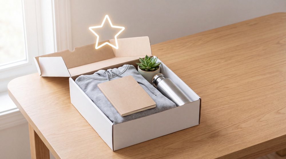
My first Nano Banana 3 prompt would ask for a slightly elevated view of the open box, with the notebook on one side, the mug on the other, and the card resting above them. I would specify soft daylight, restrained shadows, and a plain background. No extra gifts, decorative ribbons, or invented branding would be needed.
I would want the three objects to be clearly separated rather than packed into a visually dense cluster. The card should not hide the notebook completely, and the mug’s handle should remain visible. Those details would make the image useful for discussing how the kit feels, even before the packaging structure is designed.
The first version would use mostly cream and dark blue. A small accent colour on the card could provide warmth without turning the arrangement into a collection of unrelated colours. I would choose that accent from the company’s existing palette rather than introduce a new identity through the gift packaging alone.
Correct the details that imply a different kit
Suppose the draft turned the plain notebook into a leather-bound journal and added a metallic finish to the mug. I would use Nano Banana 3 to bring both objects closer to their references. The correction would ask for the actual notebook cover texture and a simple ceramic appearance while preserving the arrangement and light.
I would inspect the revised image beside the supplier photographs. The mug’s handle, the notebook’s binding, and the card’s fold should remain plausible. If the scene continued to alter important features, I would treat it as a mood reference rather than a depiction of the kit that employees will receive.
The box interior would also need attention. Objects should appear to rest on a surface, not float inside the container. I would simplify confusing shadows or overlaps before refining texture. A clear arrangement would support the founder’s decision more effectively than a highly polished image with impossible geometry.
Explore warmth through placement
For the second concept, I would keep the same objects and change the card’s position so it becomes the first thing someone sees. I would use Nano Banana 3 to explore that variation, perhaps with the notebook turned slightly and a small area of coloured tissue beneath it. The kit would feel more personal through arrangement, not through adding expensive-looking contents.
I would compare the two versions at the same size and from the same viewpoint. The question would be whether the orderly version suits the company’s tone or whether the warmer arrangement better reflects how the team wants to welcome people. A meaningful comparison needs a clear difference that the founder can actually describe.
If the tissue obscured too much of the notebook, I would reduce it. If the angled card looked careless, I would straighten it slightly. Those modest revisions would keep the concept grounded in a practical package rather than a decorative scene that would be difficult to reproduce.
Let the real welcome message do its own work
I would add the card wording in a separate design tool using text supplied by the company. The message could explain who to contact on the first day or offer a short personal welcome, but those details should be accurate. A generated image would not be the source of names, dates, or onboarding instructions.
Although Nano Banana 3 can be used to explore typography within an image, I would keep this card’s final text editable. That would make it easier to personalise a name and proofread the message. It would also separate the creative concept from the production file used to print the cards.
The company logo would come from its approved artwork rather than an invented version in the concept. I would check its spacing and colour against the brand files, then let the packaging designer prepare the final layout. The still image would remain a guide to the arrangement and mood.
Take the concept to a physical sample
Before placing an order, I would ask for a physical packaging sample with the proposed items. The Nano Banana 3 image could show the visual intention, while the sample would reveal whether the notebook and mug fit, how the inserts hold them, and what the recipient sees when opening the lid. Those are different kinds of evidence.
I would photograph the sample and compare it with the selected concept. If the real box felt too crowded, the answer might be a simpler arrangement rather than a larger box. If the card became hidden during packing, I would change its placement. The final decision should follow the physical result.
Finish with a clear, reproducible direction
My final Nano Banana 3 review would check that the selected image still shows the agreed items and the intended company colours. I would save it with the source references and a short note explaining the preferred arrangement. The packing team or designer should be able to understand the idea without guessing which decorative elements are essential.
The finished brief would contain two labelled still concepts and a clear preference, followed by a verified physical sample. It would not need to promise better retention or a measurable cultural transformation. Its immediate purpose would be smaller and more concrete: helping a company welcome a new colleague with a kit that looks considered and matches what it actually delivers.